If you want speed, control, and a professional look without hiring a full engineering team, Building a SaaS marketing site using a website builder is a smart path. In plain terms, you’ll assemble a conversion-ready site with prebuilt components, a visual editor, and a handful of proven workflows so that your message is clear and your visitors know exactly what to do. In this tutorial, you’ll get the exact playbook: positioning first, then structure, then build, copy, visuals, analytics, QA, launch, and growth. At a glance, the steps are: define your value proposition, choose your builder, map the architecture, wireframe pages, set global styles and CMS, write copy, design trust elements, instrument analytics and SEO, run a launch QA, and ship with a light growth plan. Do this well and you’ll have a fast site that explains your product, wins demos or trials, and gives you the data to improve. The outcome is a site you can update in hours, not weeks.
1. Clarify Positioning and Audience Before You Touch the Builder
The most efficient way to build a site that converts is to decide exactly who it serves and what promise it makes before you open any tool. Start by outlining your ideal customer profile (ICP): industry, role, company size, and the one costly problem they cannot ignore. Next, write a tight value proposition that names the outcome, the mechanism, and the proof. If you struggle to compress it, your product story is probably too wide; narrow it so the homepage can express it in a single headline. Then, list the top two jobs-to-be-done (JTBD)—the practical tasks prospects hire your product to accomplish—so your pages map cleanly to those jobs. Finally, identify the primary conversion you want on each key page (e.g., “Start free trial,” “Book demo”) to keep every block of content working toward one goal.
How to do it
- Draft a one-sentence value proposition formula: For [ICP], [Product] delivers [outcome] by [mechanism], proven by [evidence].
- Write 3 user stories that begin “When I…, I want to…, so I can…,” pulling directly from real calls or support logs.
- Decide the single primary CTA for the homepage and one secondary safety-net CTA (e.g., “Watch 2-minute demo”).
- List objections you hear most (cost, integration, migration) and mark which page or section will counter each one.
- Build a short glossary of your product’s key terms to keep copy consistent across the site and app.
Numbers & guardrails
- Keep your value proposition headline to roughly 8–12 words; overlong headlines often dilute clarity.
- Aim for a single ICP per site; if you have multiple, route each via a segmented hero or industry pages instead of crowding the homepage.
- Limit homepage CTAs to 1 primary and 1 secondary to avoid choice paralysis.
A crisp positioning foundation makes every later decision easier: which sections to include, what to cut, and how to guide visitors toward the right action.
2. Choose the Right Website Builder for Your Goals and Constraints
Your choice of website builder should reflect your team’s skills, the speed you need, and the level of customization required. The right tool lets you move quickly on content and design while leaving room for structured content (CMS), SEO controls, and integrations. Visual builders such as Webflow, Squarespace, Wix, Framer Sites, and WordPress with a quality visual theme or page builder each have strengths. What matters is not fashion but fit: can you set global styles, create reusable components, publish fast, integrate forms and analytics, and meet performance and accessibility targets without heavy code? Decide now, because switching later is costly in time and focus.
Comparison criteria
- Design system controls: global typography, color tokens, spacing scale, and component libraries.
- CMS structure: collections for blog, changelog, templates, and customer stories.
- Performance: built-in image optimization, clean HTML, and lazy loading.
- SEO controls: editable metadata, clean URLs, canonical tags, and schema options.
- Integrations: form routing, CRM/webhook support, analytics pixels, and Zapier/Make automation.
- Collaboration: roles, staging/previews, and version history.
Numbers & guardrails
- Typical builder subscription plus necessary add-ons commonly lands between $20–$80 per month for a small SaaS, excluding premium templates or plugins.
- Aim for Largest Contentful Paint (LCP) under 2.5 seconds on a typical mobile connection and under 2 seconds on desktop.
- Keep initial plugin/app count to fewer than 5; each add-on increases failure and performance risk.
Choosing a builder by clear criteria prevents tool churn and keeps the focus on message, speed, and measurable results.
3. Map Your Site Architecture and On-Page SEO From Day One
A simple, predictable structure helps visitors and search engines find what they need fast. Start with a lean primary navigation: Home, Product, Pricing, Solutions or Industries as needed, Resources (blog, guides), and About. From there, plan a shallow sitemap that avoids nesting content too deeply; two to three levels is plenty for a marketing site. Decide URL slugs in advance so you can keep them clean, descriptive, and stable. While this article emphasizes humans first, you should still align titles, headings, and internal links so each page targets one main topic without stuffing. Decide the canonical version for each content type, and map redirects for any future renames before launch to avoid broken links.
How to do it
- Sketch a card-sort of pages, then cluster into navigation groups with a clear “why this page exists.”
- Write one-sentence page goals and the primary CTA for each: e.g., Pricing → “Get trial signups” (Start free trial).
- Draft URL slugs that match the page topic and are easy to read: /pricing, /product/integrations, /resources/guides.
- Define internal linking: homepage → key pages; blog posts → product and relevant guides; footer → legal and support.
- Prepare default metadata patterns: titles, descriptions, and social preview images by content type.
Numbers & guardrails
- Keep top-level nav items to 5–7 to reduce cognitive load.
- Try to keep important content reachable within 3 clicks from the homepage.
- Limit URL slugs to roughly 1–5 words; shorter is usually clearer.
A thoughtful architecture reduces friction, helps visitors self-serve, and makes your later SEO and analytics more reliable.
4. Wireframe the Core Pages Before You Design
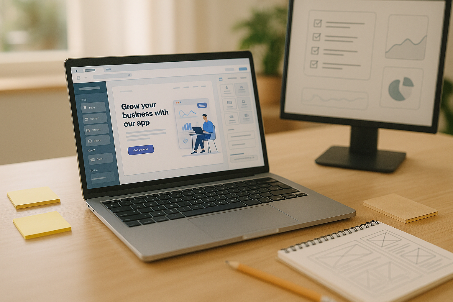
Wireframing ensures you arrange content by persuasion flow rather than by decoration. Begin with grayscale blocks for the homepage, product page, pricing, and at least one high-intent landing page. The goal is to decide hierarchy: what the hero says, which benefits lead, where social proof belongs, and how pricing and FAQs are sequenced. Keep components consistent: hero, benefits, proof, features, integrations, pricing, objections, CTA. At this stage you should also define the mobile layout; many visitors will meet your brand on a small screen. Wireframes give you a safe place to cut fluff, add missing arguments, and agree on CTAs before color and imagery distract.
Mini table: page → CTA → success metric
| Page | Primary CTA | Secondary CTA | Success Metric |
|---|---|---|---|
| Homepage | Start free trial | Watch demo | Trial signups per 1,000 visits |
| Product | Book a demo | View integrations | Demo bookings per 1,000 visits |
| Pricing | Start free trial | Contact sales | Paid trials started |
| Landing page | Start free trial | Download guide | Conversion rate on visits |
How to do it
- Use a simple tool (Figma, FigJam, Miro, or the builder’s native wireframe blocks).
- Cap the hero to headline, subhead, primary CTA, and optional social proof line—nothing more.
- Place benefits before features; benefits are outcomes, features are how you deliver them.
- Put FAQs below pricing to answer late-stage objections without derailing earlier arguments.
- Add short, specific microcopy under CTAs clarifying the next step: “No credit card,” “Takes 2 minutes.”
Close wireframes by validating with two or three prospects; if they can paraphrase your offer and point to the right CTA in under a minute, you’re ready to design.
5. Set Global Styles, Components, and CMS Collections in Your Builder
Before building individual pages, establish a lightweight design system inside the builder so every new block inherits consistency. Define typography scale, color tokens, spacing, and button variants once, then create reusable components—header, footer, hero, feature rows, testimonial cards, pricing table, and CTA banners. Next, set up CMS collections for repeatable content such as blog posts, customer stories, changelog entries, and resource guides. A good setup lets non-technical teammates add content while maintaining structure, metadata, and design without opening every page.
Setup checklist
- Typography: 2–3 font sizes for headings, 1–2 for body; set line heights for readability.
- Colors: 1 primary, 1–2 neutrals, 1 accent; define states (hover, focus, disabled).
- Spacing scale: a simple 4 or 8-point scale to keep rhythm consistent.
- Components: header, footer, hero, features, proof, pricing, FAQs, CTA, blog card.
- CMS: collections with fields for title, slug, author, summary, body, category, tags, social image, and canonical URL.
Mini case
Suppose you create 10 reusable components and use them across 8 pages. If each component saves even 10 minutes per page instance, you reclaim roughly 800 minutes—more than a full workday—while also eliminating many style inconsistencies that creep in with one-off blocks.
Systematizing styles and content structures upfront drastically reduces maintenance and keeps your brand cohesive as you scale.
6. Write Conversion-Focused Copy That Speaks Like Your Customers
Copy is your highest-leverage asset; it carries your promise, lowers risk, and guides action. Start by mirroring the language customers already use in calls, tickets, and reviews, then apply simple frameworks so your pages argue clearly. For the hero, pair a concise outcome-oriented headline with a subhead that names the mechanism and a risk reducer. For benefits, describe the before/after and quantify gains whenever possible. For CTAs, write the next action, not a label—“Start free trial” beats “Submit.” Finally, keep sentences mostly short and front-load key nouns and verbs so scanners can grasp your pitch quickly.
How to do it
- Use the Problem–Agitate–Solve (PAS) sequence on landing pages: state the pain, make the stakes tangible, present the product as the clear fix.
- Apply Features–Advantages–Benefits (FAB) to convert technical features into outcomes your buyer values.
- Write FAQ answers like mini objections-handlers rather than a dumping ground of random questions.
- Add risk-reducers near CTAs: “Cancel anytime,” “Privacy-first,” or “14-day free trial,” matched to your actual policy.
- Keep paragraphs tight; aim for one idea per paragraph and one message per section.
Numbers & guardrails
- Headlines around 8–12 words and subheads around 14–24 words often strike a good balance of punch and clarity.
- Sprinkle proof numbers where honest and specific: “Import 50,000 records in minutes,” “Reduce manual steps from 7 to 2.”
- If your trial lasts 14 or 30 days, state it clearly near the primary CTA so expectations are set.
Copy that channels customer language and frames concrete outcomes will outperform ornate prose every time.
7. Design Visuals, Social Proof, and Trust Signals That Reduce Risk
Good visuals help prospects see themselves succeeding with your product. Use clean product screenshots, short silent loops of key flows, and diagrams that explain how the system connects. Keep image files efficient and consistent in aspect ratios so layouts remain tidy across viewports. Pair visuals with social proof: recognizable logos (with permission), specific testimonials, ratings, and mini case highlights that quantify outcomes. Add trust signals such as privacy commitments, uptime badges, or compliance statements where relevant to your audience. These elements don’t replace a clear message; they reinforce it by showing that real customers win with your tool.
Practical tips
- Favor crisp UI screenshots and short product loops over generic stock photos.
- Place the most persuasive testimonial near the hero or pricing—where the commitment happens.
- Include headshot, name, role, and company on testimonials; avoid anonymous blurbs where possible.
- Use SVGs for icons and UI illustrations; for photos, compress intelligently and set width/height attributes to prevent layout shifts.
- Keep a brand-consistent style for diagrams; reuse colors and line weights from your design tokens.
Numbers & guardrails
- Target hero images under roughly 150–250 KB and defer offscreen media to maintain speed.
- Use consistent testimonial lengths of 20–60 words; longer quotes belong in case studies.
- Add at least one proof element above the fold and one near each major CTA.
When visuals and proof work together, they reduce uncertainty and make next steps feel safe and desirable.
8. Instrument Analytics, Events, and Search Essentials Before Launch
Measure from day one so you can learn and iterate. Set up a privacy-respecting analytics suite (e.g., GA4 or a lightweight alternative), connect Search Console, and add pixels only if you actually plan to run campaigns. Configure key events that map to your funnel: page view, scroll depth, CTA clicks, form submissions, trial starts, demo bookings, and content downloads. Label events consistently so reports are legible and decisions are fast. For search basics, ensure each page has a unique title and meta description, clean heading structure, and a simple XML sitemap. Finally, confirm that forms route to the right inbox or CRM and that error states are obvious and helpful.
Event map (starter set)
- cta_click (label: “Start free trial,” “Book demo,” etc.)
- form_submit (label: “pricing_trial_form” or “demo_request”)
- trial_started or signup_completed
- demo_booked
- download for guides or templates
- outbound_click for marketplace/integration links
Numbers & guardrails
- Create no more than 10–15 custom events initially; excess noise makes analysis harder.
- Use clear conversion naming and keep at least one funnel that traces homepage → product → pricing → conversion.
- Set basic performance thresholds: LCP under 2.5s, interaction ready quickly, and images sized to containers.
A measured site gives you confidence to double down on what works and to prune what doesn’t without guesswork.
9. Run a Rigorous QA and Performance Pass, Then Launch
A deliberate QA prevents avoidable issues from undermining trust right at the moment of truth. Test layouts on common devices and browsers, verify navigation and links, and check forms and error states. Review accessibility: keyboard navigation, visible focus states, alternative text, and sufficient color contrast. Inspect metadata and social previews for core pages so your brand looks right when shared. Next, run a performance pass to optimize images, lazy-load below-the-fold components, and defer non-critical scripts. Only then flip DNS or go live via the builder’s publishing flow—and keep a rollback plan ready just in case.
Launch checklist
- Verify all primary flows: start trial, book demo, and contact sales forms.
- Test 404, 500, and form error states; make them helpful and on-brand.
- Confirm global styles and component behavior on mobile and desktop.
- Check Open Graph and Twitter Card images and titles for homepage, product, and pricing.
- Generate XML sitemap, submit in Search Console, and confirm robots directives are correct.
Numbers & guardrails
- Aim for a Lighthouse performance score in the green; if a page dips lower, examine images and third-party scripts first.
- Keep total homepage requests lean; each additional script adds overhead and potential failure points.
- Ensure focus order and keyboard access are logical; accessibility is usability.
When QA is thorough, launch day becomes a quiet non-event—the best kind of milestone for a SaaS team.
10. Ship a Lightweight Growth Plan: Content, Lead Magnets, and Experiments
After launch, momentum matters more than perfection. Publish consistently on topics your ICP actually searches for, using straightforward how-to articles, comparison pages, and customer stories that demonstrate outcomes. Offer a single lead magnet—such as a checklist, template, or quick calculator—that solves a real task and trades value for an email. Set a cadence for small experiments: headline tests on the homepage, pricing page FAQ variants, and simplified signup flows. Review analytics weekly, identify one friction point, and ship one fix; in a few cycles, your site will compound results like a product roadmap does.
What to test first
- Hero headline variants that sharpen the outcome and name the mechanism.
- Pricing page layout: table vs. stacked cards; adding a short explainer next to plans.
- Trial or demo forms: must-fill fields only; reduce form fields and measure completion lift.
- Social proof placement: single powerful quote above the fold vs. multiple quotes lower on the page.
- Resource gate: ungated first, then test gating to tradeoff reach vs. lead quality.
Mini case
Suppose your homepage converts at 2.0% and you test a sharper headline plus a proof line. If conversion rises to 2.4%, that’s an additional 4 signups per 1,000 visits. Combine that with a pricing FAQ that lifts conversions another 0.3 percentage points, and you’re up to 7 extra signups per 1,000 visits—compounding gains from small, focused changes.
A simple growth rhythm—publish, measure, adjust—keeps your marketing site alive, useful, and ever closer to what customers want.
Conclusion
A high-performing SaaS marketing site is the product of a clear promise and a disciplined build process, not an ornate design or a flashy template. By anchoring your message in real customer outcomes, choosing a builder that matches your constraints, and designing pages around persuasion flow, you give visitors a path that makes sense from first glance to signup. Set global styles and structured content so your team can ship consistently. Write copy that mirrors your customers’ words, add visuals and proof that reduce risk, and instrument the site so you can learn. Then ship with a thorough QA and keep a steady drumbeat of small tests and useful content. Follow these steps and you’ll own a fast, flexible site you can evolve quickly. Start today by drafting your value proposition, then open your builder and wireframe your homepage.
FAQs
How many pages does a SaaS marketing site actually need to start?
You can launch with as few as four core pages—Home, Product, Pricing, and a high-intent landing page—plus a simple Resources or Blog hub. The key is that each page has a single job and a clear CTA. Add more only when you can articulate what the new page accomplishes that the others cannot. Overbuilding early produces maintenance overhead without improving conversions.
Which website builder should I choose for a SaaS site?
Pick the tool that balances speed, control, and team skills. If you need granular design control and a robust CMS, a more flexible visual builder is often a good fit. If you want a simple template-driven approach, a mainstream builder can be enough. WordPress with a well-supported theme works when you anticipate heavy content publishing and want maximum extensibility. The right choice is the one your team can run without bottlenecks.
Do I need a blog right away?
Not necessarily. If you have limited resources, begin with high-intent pages that answer buying questions and showcase outcomes. A blog becomes valuable when you can publish consistently on topics that lead to product consideration. If you can commit to a steady cadence with useful, specific posts—how-tos, comparisons, or customer stories—then by all means add it; otherwise, keep it simple.
What performance targets should I aim for?
Focus on fast rendering of meaningful content and keeping interactive friction low. Ensure large images are optimized, defer non-critical scripts, and lazy-load below-the-fold assets. A green performance score in common auditing tools is a practical threshold for most marketing pages. If a specific page underperforms, inspect image sizes and third-party scripts first; they’re the usual culprits.
How do I write a strong hero headline?
Lead with the outcome your product enables and name the mechanism in the subhead. Keep the headline concise and concrete—avoid conceptual slogans. Pair it with a single, specific CTA and a short proof line such as a result, rating, or customer logo. If multiple ICPs visit the same page, route them via a segmented hero rather than cramming all messages into one headline.
Where should testimonials and logos go?
Place a concise, credible testimonial near the hero or pricing section—exactly where a prospect decides to act. Keep longer quotes in case studies and use a mix of short blurbs and case highlights across the page. Use logos with permission and ensure they’re visually consistent. Remember that specificity beats hype; numbers and before/after statements make proof believable.
What should I track in analytics from day one?
Track events that map to the funnel: CTA clicks, form submissions, trial starts, demo bookings, and downloads. Maintain clean naming conventions so reports are readable and decisions move quickly. Check your search visibility via a console account and confirm that site maps and robots directives are correct. Most importantly, review your data regularly and connect changes on the site with changes in outcomes.
How do I handle pricing page complexity?
Start with a simple layout that highlights the most chosen plan and clarifies who each plan is for. Pair each plan with short bullets focusing on outcomes, not just feature lists. Add an FAQ below the table to answer late-stage objections, plus a clear contact path for edge cases. If you have usage-based elements, include a short explainer or a calculator to set expectations.
Do I need to worry about accessibility on a small site?
Yes. Accessibility overlaps with usability: clear focus states, keyboard navigation, sufficient color contrast, and descriptive link text help everyone. Alt text for meaningful images and obvious error states in forms reduce confusion and improve completion rates. Addressing these basics early is faster than retrofitting later and signals professionalism to all visitors.
How often should I update the site after launch?
Adopt a simple cadence: review metrics weekly, pick one friction point, and ship a fix. Publish one genuinely helpful piece of content at a time rather than scatter-shot topics. Refresh proofs and screenshots when product changes make them inaccurate. You don’t need constant redesigns; small, targeted improvements compound as you learn from your visitors.
References
- “Page Experience and Performance Fundamentals,” Google Search Central — https://developers.google.com/search/docs/fundamentals/page-experience
- “Introduction to Web Accessibility,” W3C Web Accessibility Initiative — https://www.w3.org/WAI/fundamentals/accessibility-intro/
- “Lighthouse Scoring Guide,” Chrome for Developers — https://developer.chrome.com/docs/lighthouse/performance/scoring
- “Writing for the Web,” Nielsen Norman Group — https://www.nngroup.com/articles/writing-for-the-web/
- “Search Engine Optimization Starter Guide,” Google Search Central — https://developers.google.com/search/docs/fundamentals/seo-starter-guide
- “Content Design: Planning and Writing,” GOV.UK — https://www.gov.uk/guidance/content-design
- “GA4 Events: Create and Modify,” Google Analytics Help — https://support.google.com/analytics/answer/9322688
- “WCAG Quick Reference,” W3C — https://www.w3.org/WAI/WCAG21/quickref/
