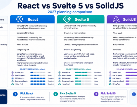
| Approach | Ships styling? | Ships behavior/accessibility? | Survives a rebrand by |
|---|---|---|---|
| Full component library (e.g. Material UI, Ant Design) | Yes, opinionated defaults | Yes, built in | Overriding theme variables; deep visual changes often fight the library’s own CSS specificity |
| Headless / unstyled primitives (Radix Primitives, React Aria) | No — you own 100% of the CSS | Yes, accessibility and behavior only | Design nearly always; you’re never fighting inherited styles |
| Copy-paste generators (shadcn/ui) | Yes, but the code lives in your repo | Yes, via underlying Radix primitives | Editing files you own directly, no upstream override fights, no update-breaks-my-theme risk |
| Token-only layer (Style Dictionary, Tokens Studio) with no component library | Only variables, no components | No | Definition — it’s the layer that makes any of the above rebrand cleanly |
Why Most Design Systems Don’t Survive Their First Rebrand
A design system usually starts as a component library: a Button, a Modal, a Card, built to match the brand at the time. The moment marketing hires a new agency and comes back with a new palette, a new type scale, and rounder corners, that component library reveals whether it was actually a design system or just a styled component kit. If the color, spacing, and typography decisions were hardcoded inside component CSS — a hex value in a Button’s stylesheet, a pixel value baked into a Card’s border-radius — every rebrand becomes a grep-and-replace exercise across hundreds of files, with the near-certainty of missing some.
The systems that survive do one thing differently: they separate what a component does (its behavior, accessibility, and DOM structure) from how it looks (color, spacing, radius, elevation, motion). That separation is what a token architecture buys you. When the brand changes, you change token values in one place, and every component that references those tokens updates automatically — no component code changes, no PR touching two hundred files, no risk of a missed instance. Much of the open-source tooling that makes this practical — bundlers, CSS processors, testing frameworks — comes from the same open-source web development tools ecosystem that most frontend teams already rely on daily.
Design Tokens: The Layer That Actually Survives Redesign
Design tokens are named, platform-agnostic values — a color, a spacing unit, a font size — that stand in for hardcoded values throughout a codebase. Instead of a button having background-color: #4F46E5, it references a semantic token like color.action.primary, which itself points to a raw value like color.indigo.600. That indirection is the entire trick: the button’s code never changes across a rebrand, only the value the token resolves to.
This finally has a real standard behind it. The W3C’s Design Tokens Community Group (DTCG) published the first stable version of the Design Tokens Format Module (2025.10) in October 2025, giving tools a vendor-neutral JSON format for exchanging token definitions across design and code — including theming and multi-brand support, modern color spaces like Display P3 and OKLCH, and token aliasing/inheritance. Tools like Style Dictionary (originally built and open-sourced by Amazon) consume token source files and compile them into CSS variables, iOS Swift constants, Android XML, and more from a single source of truth, so design and engineering never drift out of sync.
Layer tokens in three tiers to make redesigns painless: core/primitive tokens (raw values — blue.500, space.4), semantic tokens (purpose-based aliases — color.background.surface, color.text.danger) that reference primitives, and component tokens (component-specific aliases — button.primary.background) that reference semantic tokens. A rebrand almost always only touches the primitive tier; semantic and component tokens keep pointing at whatever the new primitives define, and nothing downstream needs to be touched at all.
Figure 1: Three-Tier Token Architecture
Primitive tokens (raw values: indigo.600 = #4F46E5, space.4 = 16px) → Semantic tokens (purpose: color.action.primary = {indigo.600}, spacing.md = {space.4}) → Component tokens (specific usage: button.primary.bg = {color.action.primary}). A rebrand replaces only the primitive tier’s values; every semantic and component token — and therefore every component — updates automatically without a single line of component code changing.
Layering pattern derived from common W3C DTCG-aligned implementations (Style Dictionary, Tokens Studio) as of the 2025.10 stable specification.
Headless Components vs Full Component Libraries
The second decision that determines redesign survival is how much visual opinion your component library bakes in. Full component libraries like Material UI or Ant Design ship both behavior and a complete visual language; restyling them for a serious rebrand usually means fighting the library’s own CSS specificity and overriding deeply nested class names, which gets harder as the gap between “your brand” and “the library’s default brand” grows. This is the same tension that shows up when teams evaluate mobile app libraries and SDKs — opinionated defaults accelerate day one but can cost more to override later.
Headless (unstyled) libraries take the opposite approach. Radix Primitives — the foundation underneath shadcn/ui — provides fully accessible, WAI-ARIA-compliant behavior for patterns like dialogs, dropdowns, tooltips, and popovers, but ships zero default styling. You own 100% of the CSS, so a rebrand is purely a styling exercise with no fight against inherited visual defaults. shadcn/ui goes a step further architecturally: instead of installing a library from a package registry, its CLI copies component source code directly into your repository. That means there’s no “upstream version” to fight during a redesign — you’re editing files you already fully own, and there’s no risk that an unrelated library update quietly changes your component’s markup out from under your new theme.
The tradeoff is upfront investment. Headless primitives and copy-paste generators require your team to build (or adopt) its own styling and documentation layer, whereas a full component library gives you a complete look immediately. Teams that expect to rebrand more than once — which, per multiple design-system case studies, is most teams within a three-to-five-year horizon — increasingly find the headless investment pays for itself the first time marketing calls for a fresh look.
Versioning Strategy: Don’t Let a Rebrand Become a Breaking Change
Even with tokens and headless primitives, a redesign changes visual output, and visual output changes are still changes your consuming teams need to plan around. Semantic Versioning (MAJOR.MINOR.PATCH) is the standard mechanism: PATCH releases fix bugs without visual or API change, MINOR releases add new tokens or components without breaking existing usage, and MAJOR releases signal that consuming teams need to review and possibly update their code — which a full rebrand typically warrants, even if no component API technically changed, because visual regression testing baselines will shift wholesale.
Two versioning granularities are common: library-level versioning, where the entire design system ships one version number, and component-level versioning, where each component tracks its own version independently. Library-level versioning is simpler to communicate and is the better default for most teams; component-level versioning pays off mainly for very large, multi-team systems where different components genuinely evolve at different speeds. Whichever granularity you choose, deprecate before you delete: mark old tokens or components as deprecated with a clear migration path and an end-of-life date, rather than removing them in the same release that introduces their replacement — the same disciplined communication that underpins good SaaS product launch practices more broadly.
| Change type | Version bump | Redesign-specific example |
|---|---|---|
| Patch | x.x.PATCH | Fix incorrect focus-ring color on the new theme without changing tokens or APIs |
| Minor | x.MINOR.x | Add new semantic tokens for a new brand accent color, old tokens still resolve |
| Major | MAJOR.x.x | Swap the entire primitive token set for a full rebrand; visual regression baselines reset |
Theming Architecture: Supporting More Than One Brand at Once
Many teams don’t redesign once — they maintain multiple brands, white-label products, or light/dark modes simultaneously, which is really the same problem as “surviving a redesign” solved continuously rather than as a one-time event. The pattern that scales is a token override map per theme: a base semantic token layer, with theme-specific files (light, dark, brand-b) that override only the primitive values those semantic tokens resolve to. CSS custom properties are the most common runtime mechanism on the web — a theme switch becomes swapping which set of CSS variables is active on the root element, with no component re-render logic required at all, and no JavaScript-driven style recalculation beyond toggling a class or data attribute.
This is also where the SaaS product lens matters: a design system that only serves one internal team has different constraints than one embedded across a multi-tenant SaaS product where each customer may want white-labeled branding. In that context, the token layer isn’t just a redesign-survival tool, it’s the actual mechanism that makes per-customer theming possible without maintaining separate component codebases per client — a discipline that carries over directly to cross-platform mobile development frameworks that need one design language spanning iOS, Android, and web from a single token source.
Building the Migration Path Before You Need It
- Step 1. Audit hardcoded values. Search your codebase for raw hex colors, pixel values, and font sizes inside component files — every hit is a future rebrand landmine.
- Step 2. Define your three token tiers. Separate primitive, semantic, and component tokens explicitly, even if you start with a small set.
- Step 3. Adopt a build tool. Wire tokens through Style Dictionary or an equivalent so one JSON source compiles to CSS variables, iOS, and Android outputs consistently.
- Step 4. Choose your component foundation. Decide between a full library, headless primitives, or a copy-paste generator based on how often you expect to rebrand and how much styling ownership your team wants.
- Step 5. Set a versioning policy in writing. Document what counts as patch, minor, and major before your first breaking change happens, not during the scramble.
- Step 6. Rehearse a fake rebrand. Swap your primitive token values to arbitrary placeholder colors and confirm nothing in component code needs to change — if it does, you’ve found your remaining landmines before marketing does.
Common mistakes
- Hardcoding brand colors and spacing directly into component stylesheets instead of referencing tokens, which is the single biggest cause of expensive rebrands.
- Skipping the semantic token layer and pointing components directly at primitives, so a palette change requires touching every component instead of one alias.
- Adopting a full component library for its visual polish, then discovering during the first rebrand that overriding its CSS specificity costs more than building headless would have.
- Deleting deprecated tokens or components in the same release that introduces replacements, breaking consumers with no migration window.
- Treating a rebrand as a “just update the CSS” task without bumping a major version, leaving consuming teams unaware their visual regression tests will fail.
- Building a token system with no build pipeline, so design tools and code silently drift out of sync within a few months.
In practice
Design systems teams that weather rebrands smoothly tend to treat the token layer as the actual product, and components as a thin, replaceable presentation layer on top of it. A common real-world pattern: the design system team owns primitive and semantic tokens plus a small set of headless-based core components; product teams consume both but are free to build their own composed components on top, as long as those components only ever reference semantic tokens, never raw values. When a rebrand lands, the design system team updates the primitive tier and cuts a major version; consuming teams update their dependency, run their existing visual regression suite against the new baseline, and file targeted fixes only where a component made an assumption the new theme violates — usually contrast on a rarely-used state, not a wholesale rebuild. Teams following this pattern report rebrand timelines measured in days rather than the multi-quarter re-platforming efforts that hardcoded systems require.
Glossary
- Design token
- A named, platform-agnostic value (color, spacing, font size) that stands in for a hardcoded value so visual decisions can be changed in one place.
- Primitive token
- A raw design value with no semantic meaning attached, such as blue.600 or space.4.
- Semantic token
- A purpose-named token that references a primitive, such as color.action.primary, describing intent rather than a literal value.
- Headless component
- A component that ships behavior, state management, and accessibility but no visual styling, leaving all CSS decisions to the consuming team.
- Style Dictionary
- An open-source build tool that compiles a single design token source into platform-specific outputs like CSS variables, Swift, and Android XML.
- Semantic Versioning (SemVer)
- A MAJOR.MINOR.PATCH versioning scheme where major bumps signal breaking changes, minor bumps add compatible features, and patches fix bugs.
- Theming architecture
- The structural pattern (typically token override layers) that lets an app render multiple visual brands or modes from one component codebase.
- Design system governance
- The ownership model, review process, and deprecation policy that keeps a design system from drifting into inconsistency over time.
Key Takeaways
- Design systems survive rebrands when visual decisions live in tokens, not hardcoded inside component stylesheets.
- The W3C Design Tokens Community Group’s 2025.10 stable format gives teams a vendor-neutral way to exchange tokens across design tools and code.
- A three-tier token structure (primitive, semantic, component) means a rebrand only ever touches the primitive layer.
- Headless libraries like Radix Primitives and copy-paste generators like shadcn/ui remove the CSS-override fight that full component libraries create during a redesign.
- Semantic Versioning, applied honestly to visual changes and not just API changes, prevents a rebrand from silently breaking consuming teams.
- Theming architecture for multi-brand or light/dark support is the same discipline as redesign survival, applied continuously rather than once.
- Rehearsing a fake rebrand by swapping primitive token values is the cheapest way to find remaining hardcoded values before an actual redesign does.
FAQs
What’s the difference between a design system and a component library?
A component library is the set of reusable UI building blocks (buttons, modals, inputs). A design system is broader: it includes the component library plus the token architecture, documentation, governance, and design principles that keep those components consistent and maintainable over time.
Do I need to follow the W3C Design Tokens format exactly?
Not strictly, but aligning with the 2025.10 stable specification means your tokens work with a growing ecosystem of tools (Figma plugins, Style Dictionary, IDE extensions) without custom adapters, which saves significant integration work as your system grows.
Is shadcn/ui a component library or something else?
It’s a code generator, not a traditional npm-installed library. Its CLI copies component source (built on Radix Primitives and Tailwind CSS) directly into your project, so you own and can freely modify the code with no upstream dependency to manage.
Should a small team bother with a formal token architecture?
Yes, even a lightweight version. Even a handful of semantic tokens (background, text, border, accent colors referencing a few primitives) prevents the most common failure mode: hardcoded hex values scattered across component files that make any future visual change expensive.
How often should a design system version bump happen?
There’s no fixed cadence; it should match the pace of real change. Patch and minor releases can ship as often as needed since they’re non-breaking. Major releases should be planned and communicated in advance, since they typically require consuming teams to allocate migration time.
Can headless components hurt accessibility if we build our own styles?
Not if you preserve what the primitive provides. Libraries like Radix Primitives handle ARIA attributes, keyboard navigation, and focus management internally; your styling layer only needs to avoid removing focus indicators or breaking color contrast, not rebuild the accessibility logic from scratch.
What’s the biggest hidden cost of a full (non-headless) component library?
CSS specificity fights during a serious visual overhaul. Because the library ships its own opinionated styles, overriding them deeply enough to match a new brand often requires more CSS than building from unstyled primitives would have, especially for a second or third rebrand.
How do design tokens help with light/dark mode specifically?
Semantic tokens like color.background.surface can resolve to different primitive values depending on an active theme attribute, so light and dark mode become two value sets for the same token names rather than duplicated component logic.
References
- W3C Design Tokens Community Group, “Design Tokens Format Module 2025.10” — https://www.designtokens.org/tr/drafts/format/
- W3C Design Tokens Community Group, “Design Tokens specification reaches first stable version” — https://www.w3.org/community/design-tokens/2025/10/28/design-tokens-specification-reaches-first-stable-version/
- Style Dictionary, official documentation — https://styledictionary.com/info/tokens/
- Radix UI, “Primitives” documentation — https://www.radix-ui.com/primitives
- shadcn/ui, official documentation — https://ui.shadcn.com/docs
- Nathan Curtis, EightShapes, “Versioning Design Systems” — https://eightshapes.com/articles/versioning-design-systems/